Designing a Logo

When commissioned for a new logo project I have often heard in our first meeting how logo design sites have excellent work for only $99. From there I have a meter-stick to go by.
If you Google logo design you'll see what I mean. It's not that simple. The rules are logical yet overlooked by most. If you keep these rules in mind you'll end-up with something to be proud of.
- Does it shrink well?
- Not too many fonts?
- Will it go black and white?
- Will it fax?
- Simple enough to use as a watermark?
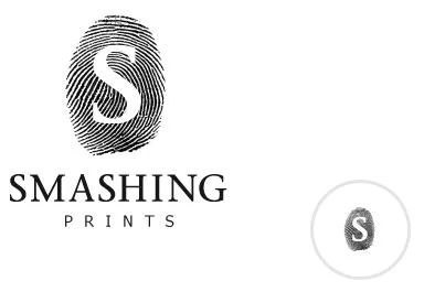
Prime example of a logo looking fantastic but what happens when you need to shrink it?
Excellent examples are Apple and Starbucks. They evolved while maintaining their iconic presence.
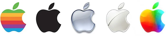
Apple's evolution
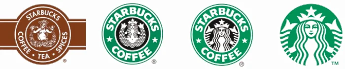
Starbucks' evolution
An effective logo looks like it was simple to do. The real art is in the execution.
A handy tool is this questionnaire.
Summary Block
Recent Logos


Sed purus sem, scelerisque ac rhoncus eget, porttitor nec odio. Lorem ipsum dolor sit amet.